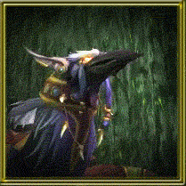
On a sidenote: I felt that the black background was getting a bit too... Depressing? So, I decided to change the layout a bit. A light yellow, a different font, and a screenshot of my lovely druid, flapping about in Hellfire Peninsula as a header pic. Kind of wish I knew how to move the title text down to the bottom of the picture, though... Will have to research that.
Edit: Found it, and it looks a lot better! This place had the solution.
Why RB6 Siege Hacks Are SO POPULAR!
5 years ago


No comments:
Post a Comment